Staying on top of web design trends can be a daunting task for any business.
Knowing when to make a change can be scary and hard to justify when it doesn’t appear that anything is broken. However, there are some excellent reasons to update the look of your site. Probably the most common is that an outdated site doesn’t instill confidence in the customer’s view of your brand or the products and services you sell.
Ask yourself, when is the last time the site has seen a redesign? If it’s longer than 2 – 3 years, then it’s likely time to evaluate your website to avoid looking stagnate. You’ll hear from customers regarding functionality issues but typically not as much about the site’s look. The problem is that looking dated doesn’t happen overnight. It’s almost imperceptible, especially to those closest to it. It will sneak up on you, and then you’ll want to throw your old website out the window. Such a rash action might not be necessary.
You can do several things to tweak the site to stay current and avoid a complete overhaul. Let’s explore a few simple enhancements that might help breathe new life into your store.
1. Update Your Typography
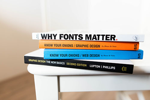
Replace your fonts with something more fitting of your brand if you haven’t already. Web fonts have come a long way in the past 5 years, and you can find a web version of almost any font you want. Keep font choices to a max of three (one for headers, one for body text, and one for subtitles or quotes) to avoid a slow down initial site load times and an opportunity to rise in bounce rates. Enlarge your headings and take advantage of your new fonts. Take inspiration from your business’ print pieces, assuming they’re well designed.
2. Wow Customers with Quality Imagery
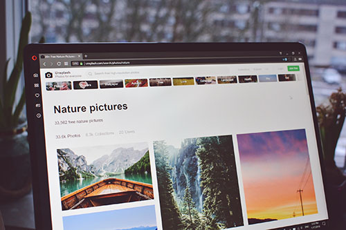
If you’re not already investing in quality photography, now’s the time. Large quality photography mixed with your new modern font would be a huge improvement to your marketing spots. There are a few things to keep in mind when choosing just the right imagery for your website. First, make sure your images are brand relevant, use real people, and optimize image file names to boost SEO. Spice it up further by combining photos with custom illustrations that add whimsy and help draw attention and impress your customers.
3. Be Strategic With Color
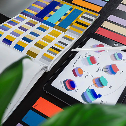
Don’t be afraid to use bright colors to draw attention to a feature or sale. A best practice is to choose a primary color palette, usually a set of colors relating to your brand. Use a little bit of color psychology to see which colors will pull your users into your product line. Once you’ve enticed them to dig more into your product, try using subtle background color shifts – could be greys – to break up any long product descriptions and pair them with images to keep the shopper engaged.

4. Refresh Your Buttons
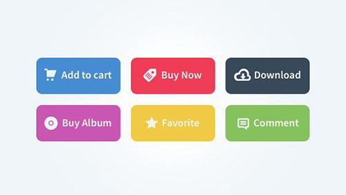
Are your buttons pill-shaped with a glossy effect to them? It might be time to switch them out for more modern flat-colored buttons (or very subtle gradients). A couple of tips to live by for buttons on your eCommerce websites: Make your button prominent by either making it slightly larger or using a bright color, but please don’t make users play hunt-the-button. If users have to hunt for your CTA (call-to-action) button, they may either get confused, leave the site or accidentally take the wrong action. Next, avoid too many buttons; giving the users too many options causes frustration. And lastly, make your buttons look like buttons – this may seem obvious, but there are still many messy buttons out there to clean up.
5. Switch Out Your Old Icon Images
Do your icons look blurry on your phone? That’s probably because they don’t take into account pixel density and are stretched two times their original size. One of the best ways to combat this is to switch to vector icons which are resolution independent. You can use SVGs (Scalable Vector Graphics) or the more popular icon fonts to achieve crisp-looking icons at all sizes. There are many resources that allow you to browse free icon font collections and even create a custom one.
6. Let Your Brand Shine
Do you ever look at your mailers and catalogs and think “I wish the website looked this good?” Maybe it’s time to blur the lines between your web and print design styles. Try and gather all of your favorite print pieces and find style patterns that you like most and implement them on your website. It’s in your best interest to keep your brand consistent across both channels. If you have brand guidelines, use them. But don’t be afraid to revise them to be more versatile on the web. For example, if you only have 2 or 3 approved colors in your brand guide, it makes it difficult to draw attention where it’s needed. Add a few accent colors that will add some life into your storefront.
UX Enhancements: Going Beyond Design
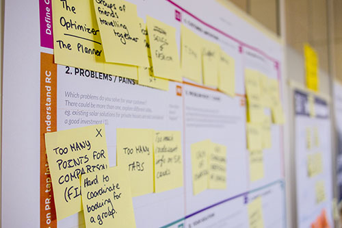
Design isn’t everything. Today’s shoppers demand a satisfying user experience (UX) as well. Please don’t make your customers stumble through your store trying to find what they want. They require an intelligent search with instant results. They would love well-organized navigation that allows for efficient browsing of categories. They need the ability to filter products by brand, color, style, and material. The old phrase “the customer is always right” is still quite relevant to today’s online businesses. Keep your customers happy, keep life simple, and they’ll keep coming back.
For a list of ways to improve your site’s UX, read the rest of this article here.
7. Enhance Your UX
When we’re building a website, sometimes we focus too much on features and information but forget about our audience. User Experience should be at the forefront of your team’s mind when refreshing your business’s website. For instance, in navigation, many sites have eased the user journey of dynamic product catalogs through a simplified single-point megamenu navigation structure rather than traditional horizontal top navigation.
Furthermore, the mobile experience should be enjoyable and easily digestible to the user. If you’ve ever had to pinch or pull to zoom in on the copy of a website just to read it on mobile, you know that pain. With nearly half of customers shopping on mobile and Google now prioritizing mobile-friendly sites, going responsive would be foolish to ignore.
If you’re not prepared to do them on your own, contact us and we can help guide you through it.
In the end, an amazing creative UI/UX team is your best bet for implementing these and other modernizations in your store. It’s one of the many services we offer here at BlueSky Commerce.
Originally posted: November 2016
