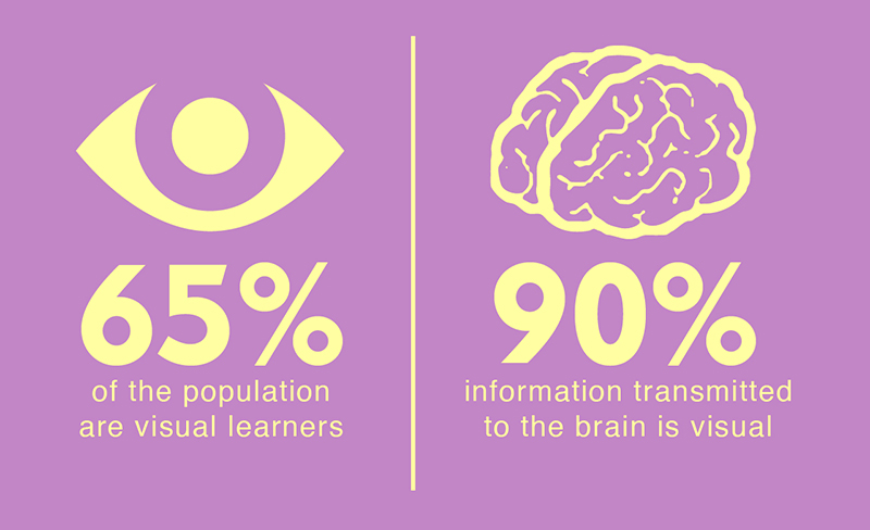
Raise your hand if you are a visual learner. You are not alone. According to Studying Style, 65% of all people are visual learners. Looking at this slightly differently, 90% of all information transmitted to the brain is visual!
Often, when working with clients in strategic planning, the scariest and yet most necessary parts of a great strategic foundation are documenting the basic questions to any organization’s operations. These fundamental questions are (and in this order):
STRATEGIC QUESTIONS
- WHAT work are we trying to deliver?
- WHY is this work so important to us (and our customers)?
- WHO does this work, and WHO does it impact?
OPERATIONAL QUESTIONS
- HOW do we get the work done?
- WHERE does this work get done?
- WHEN should we do this work?
When organizations consider hiring us (or any consultancy), they often get hung up on the OPERATIONAL QUESTIONS. It is easier in the brain to go to how to do something (a system or software perhaps) and when it should be done (budget, deadline, etc.). However, if the organizational leaders back up and answer the STRATEGIC QUESTIONS first, it becomes easier to answer the rest.
For both types of questions, the activity that creates the most heartburn is documenting repeatable processes and functions. Why? They are time-consuming, and the thought of writing it down is tedious. It might even uncover how “messy” something (everything) is. That’s where documentation in the form of visuals can become your biggest asset.
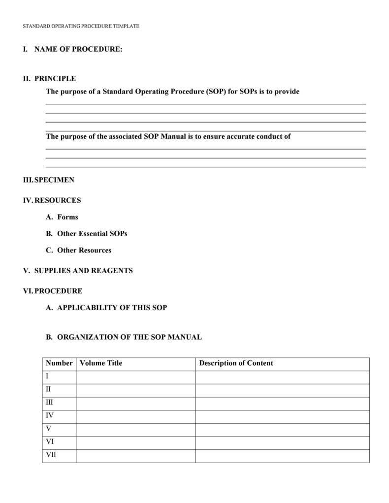
Take documenting Standard Operating Procedures (SOPs) as an example. The traditional method uses a Word Processing template to write each essential process out (see attached).
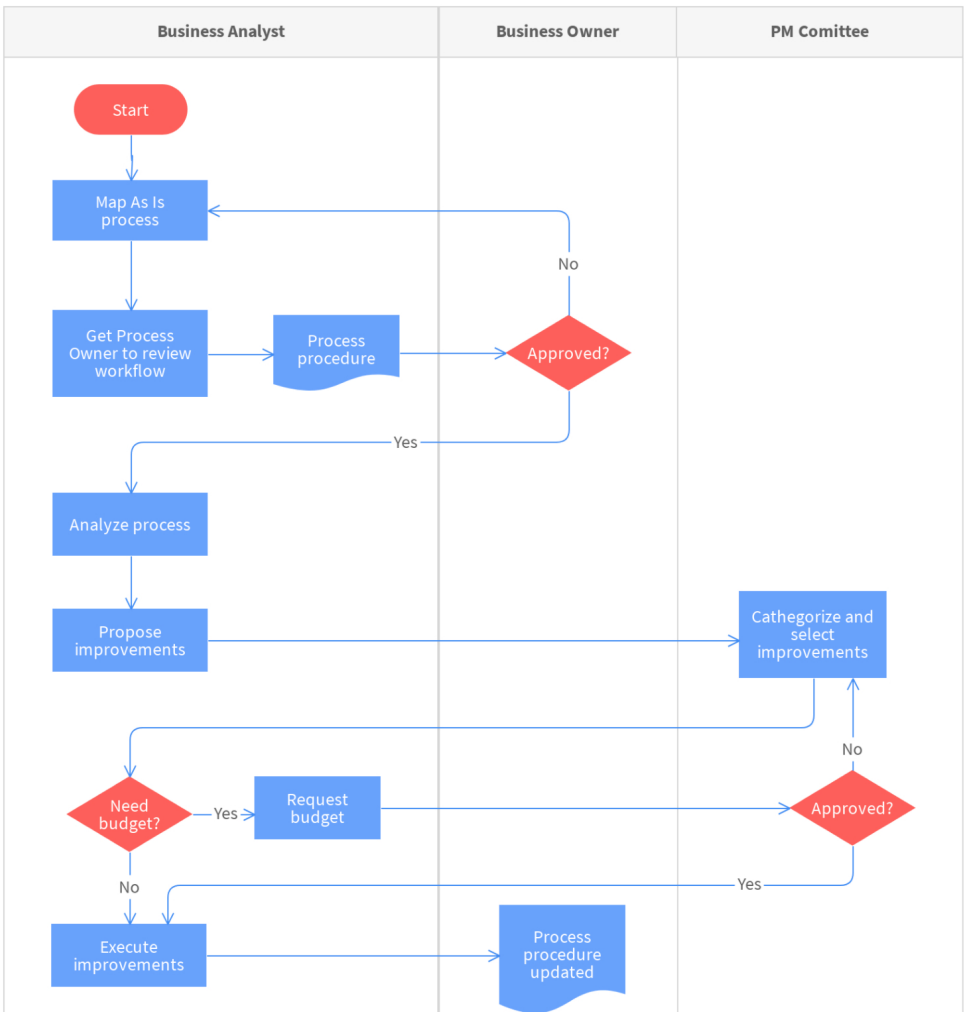
However, if you think of a SOP in a graphic flow, the process of documenting becomes less daunting and the person learning it has a better chance of understanding it and executing it.
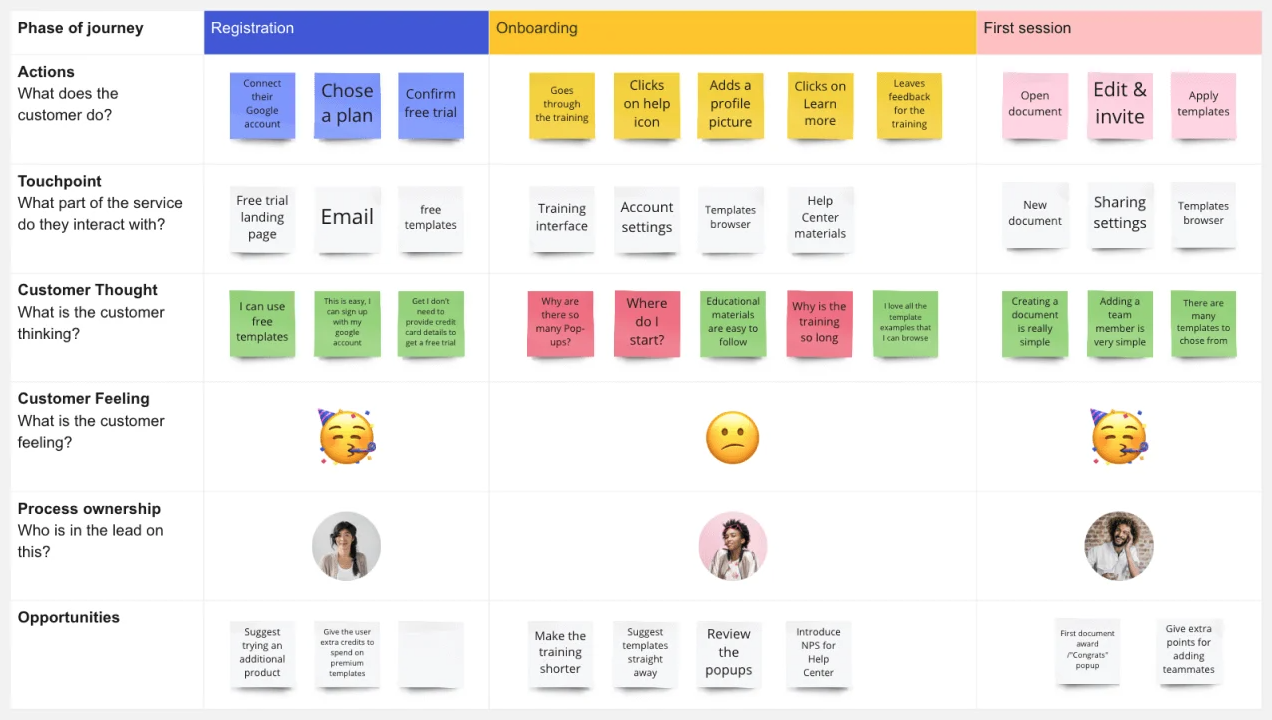
Another example of a flow chart is a Journey Map which can be found in Marketing or HR departments. A Journey Map explores the customer or employee experience. It is the most effective way of laying out the current state and allowing users to recommend changes. In this case, the ideal state is best comprehended visually (see attached).
The best lessons come from how front-end designers and developers consider the UI-UX of a web page (and subsequent wireframe). The visual interpretation for the user, designer, developer, and even executive is easier to grasp than the words. After all, a picture is worth a thousand words (and video is like a million!).
The same holds true for laying out your sales pipeline to program or tune your CRM and let us not forget that structure follows strategy. The ever-important organizational chart for your teams and overall organization is best represented visually for all to understand. Whether your organization is starting your strategic planning or just laying out key work processes for a project, there are so many tools available, from Visio and Draw.io to Gliffy and Miro, to just name a few.
When you are faced with what seems like the daunting task of documenting anything in your organization, put down the notepad and pick up a sketch pad. Use a physical or virtual whiteboard. Collaborate with your team. Make the scary fun and, most importantly, visual.


